Kern Conference
FALL 2021. Branding/Editorial Design/Layout Design
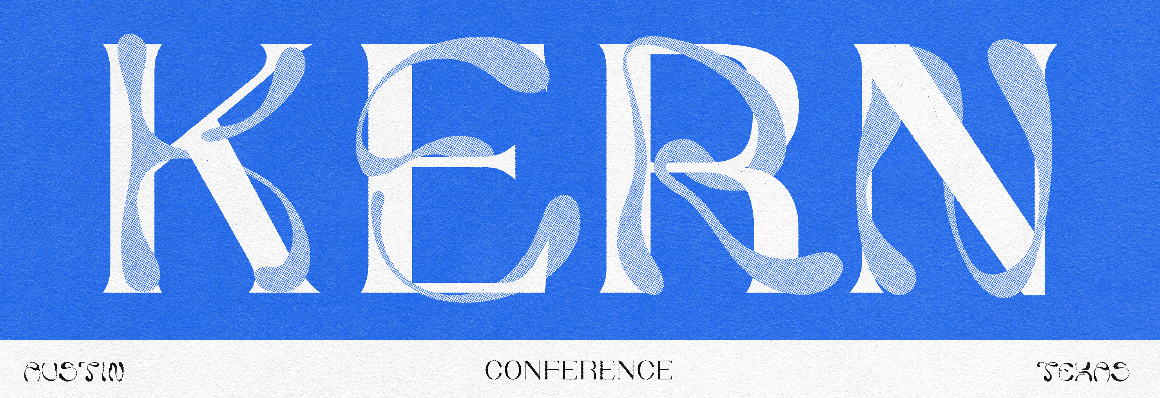
Developed for my Identity Systems class, I was assigned the objective of creating a brand for a Typography conference. I created the KERN Type Conference brand as a celebration of letterforms and typography. Inspired by the intricacies of different genres of typefaces, I decided to marry two opposing letterforms into one cohesive logo design. The following resulted in an experimental brand with a living logo that utilized type as image.
Project Brief:
KERN is an annual design conference that celebrates typography, typographers, font designers, and letterers.
Your challenge is to:
Design the conference logo system
Develop a typographic layout system that can cohesively unify all conference touchpoints,
Document the system in a brand guidelines document
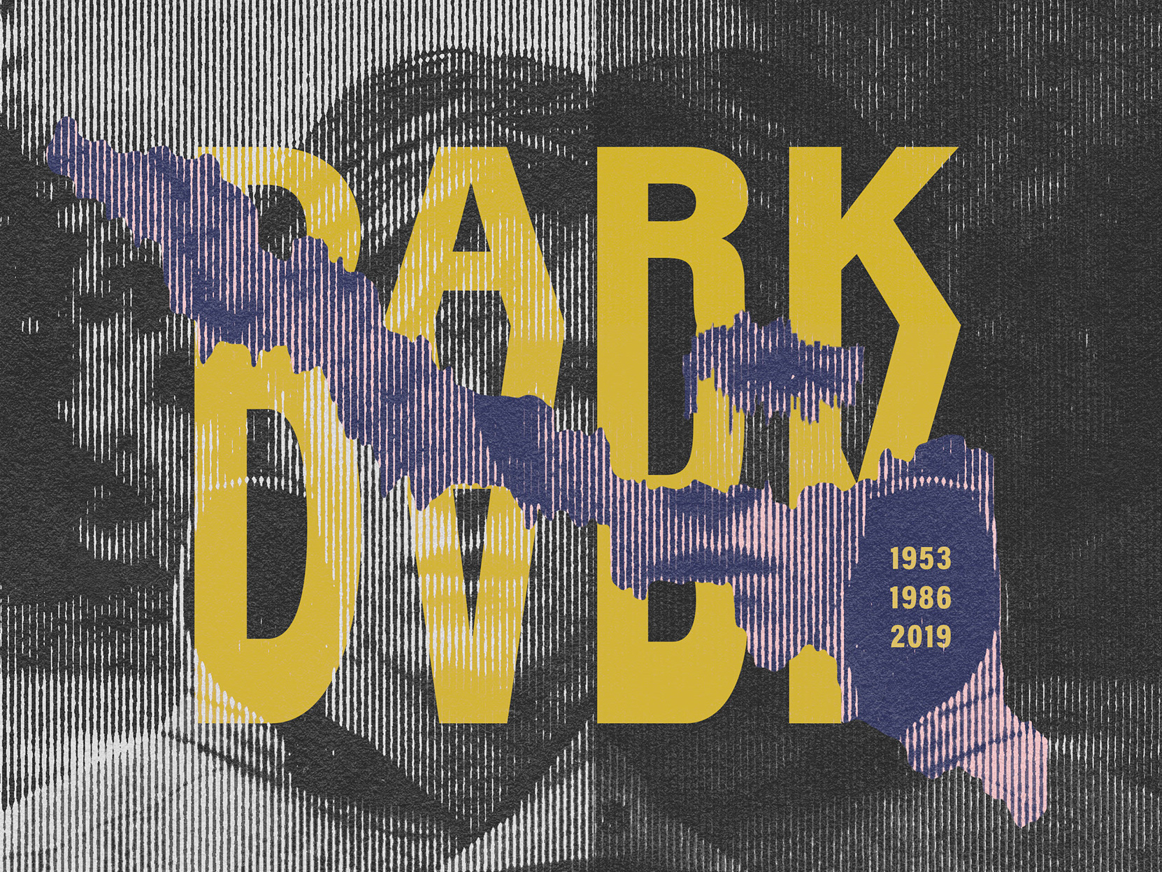
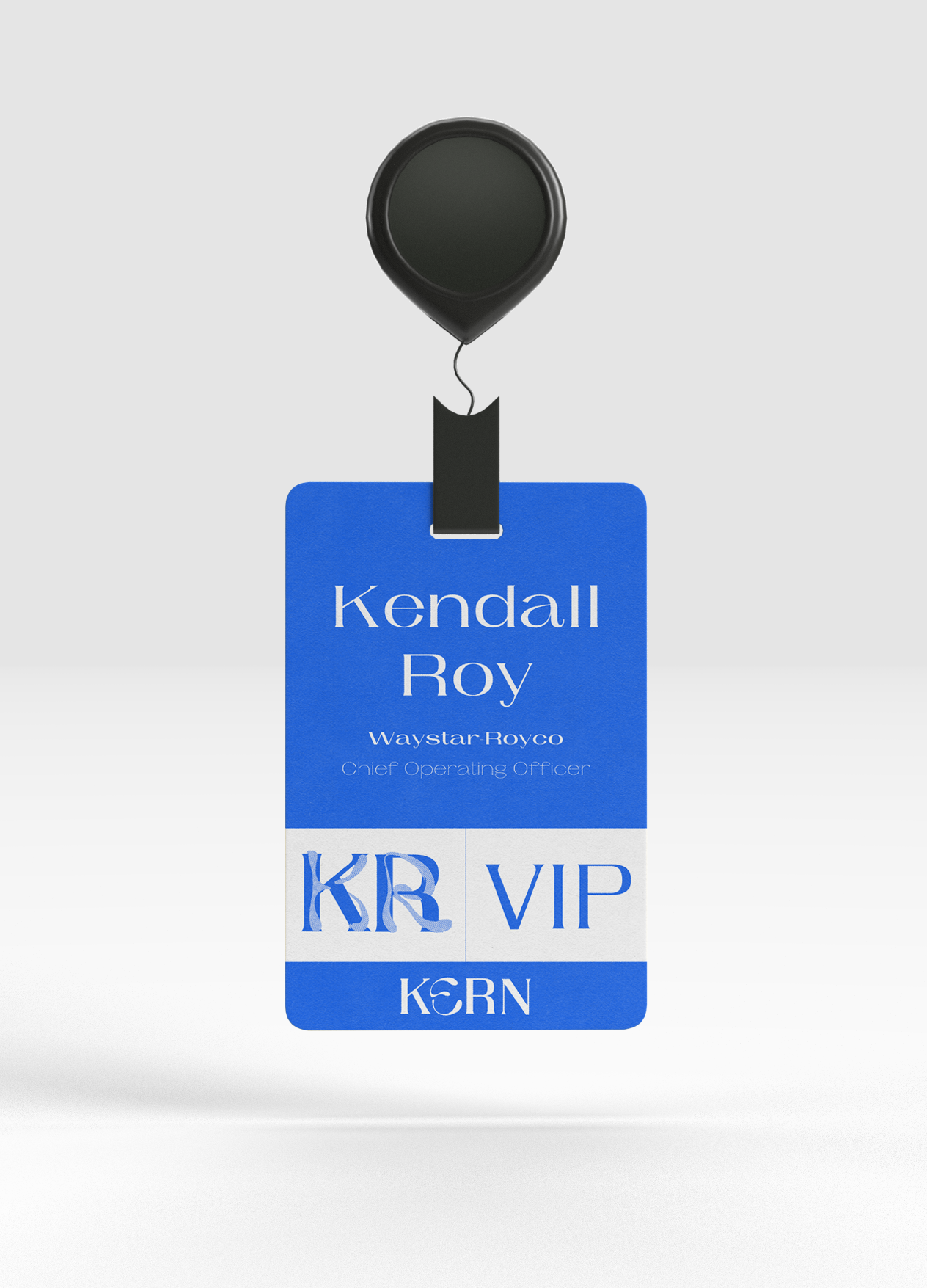
BRAND BOOK
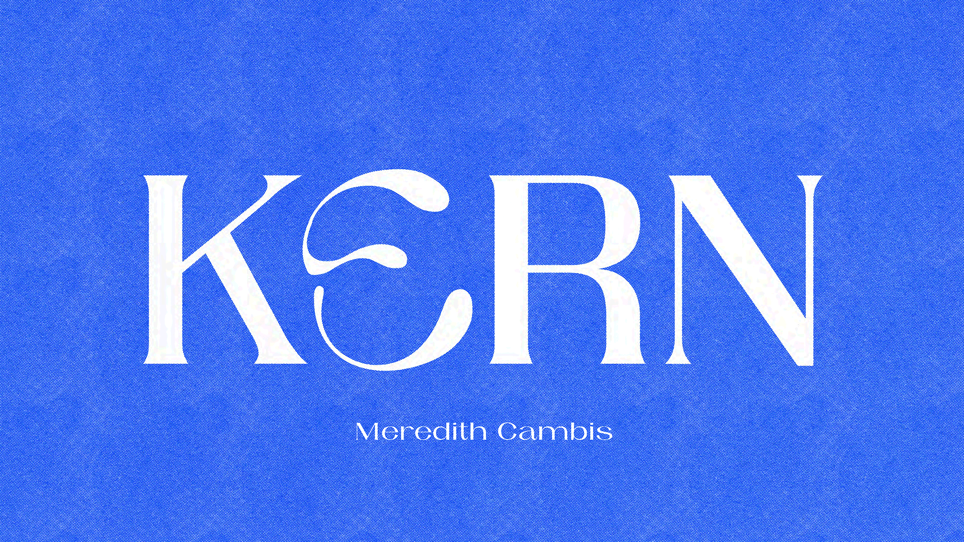
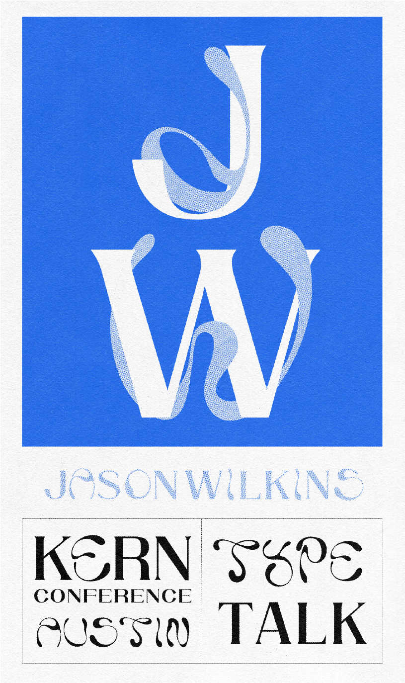
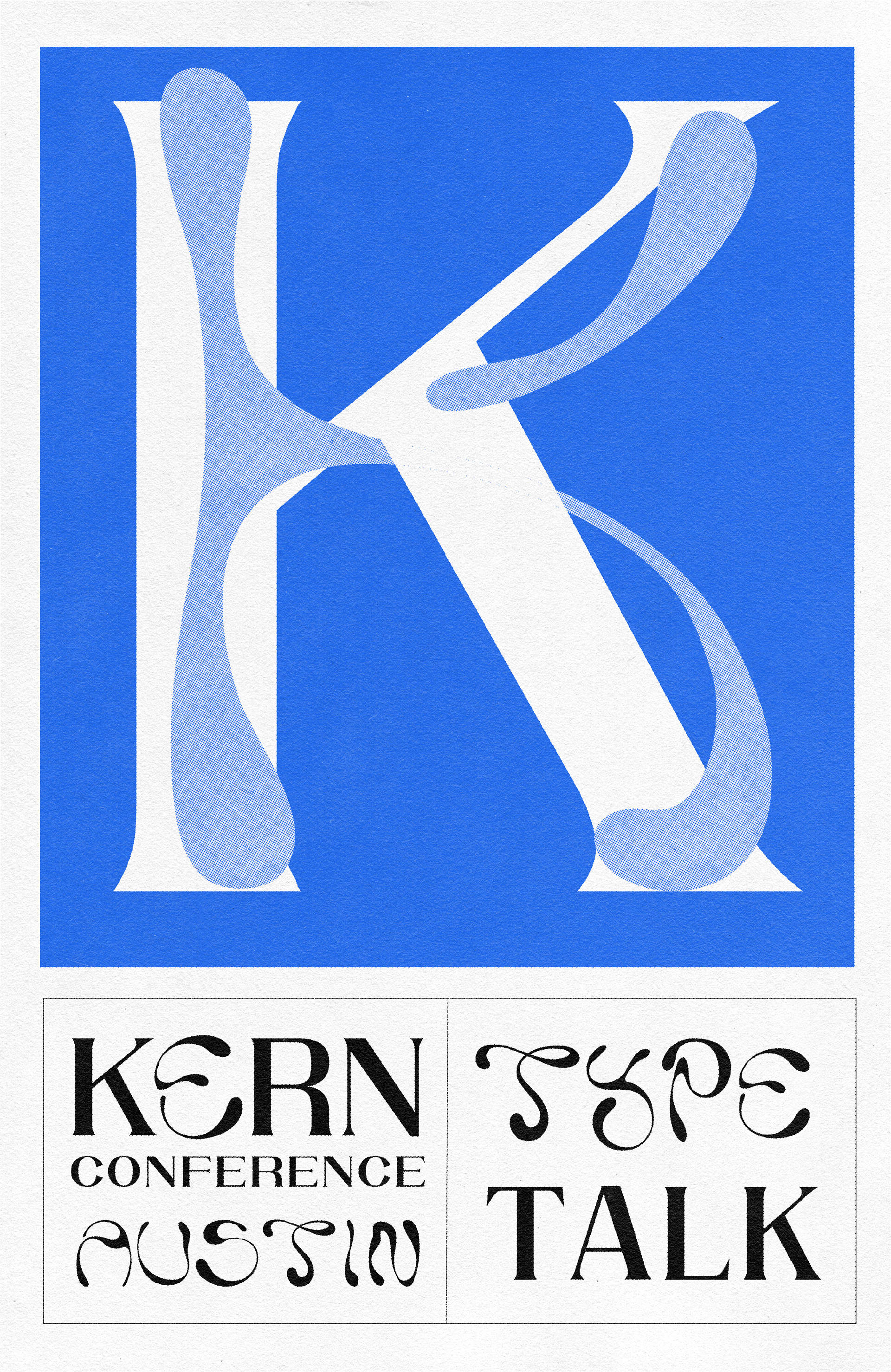
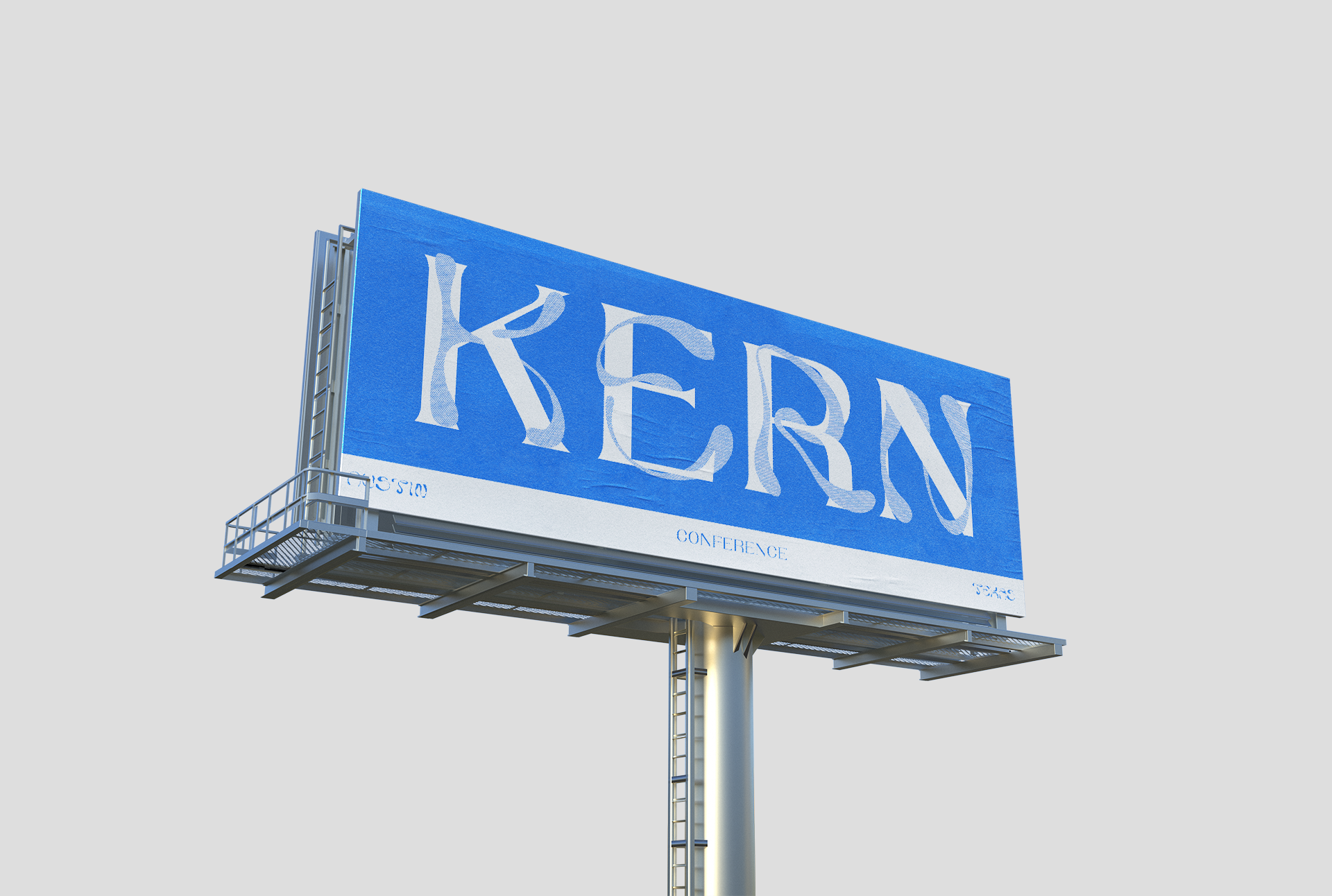
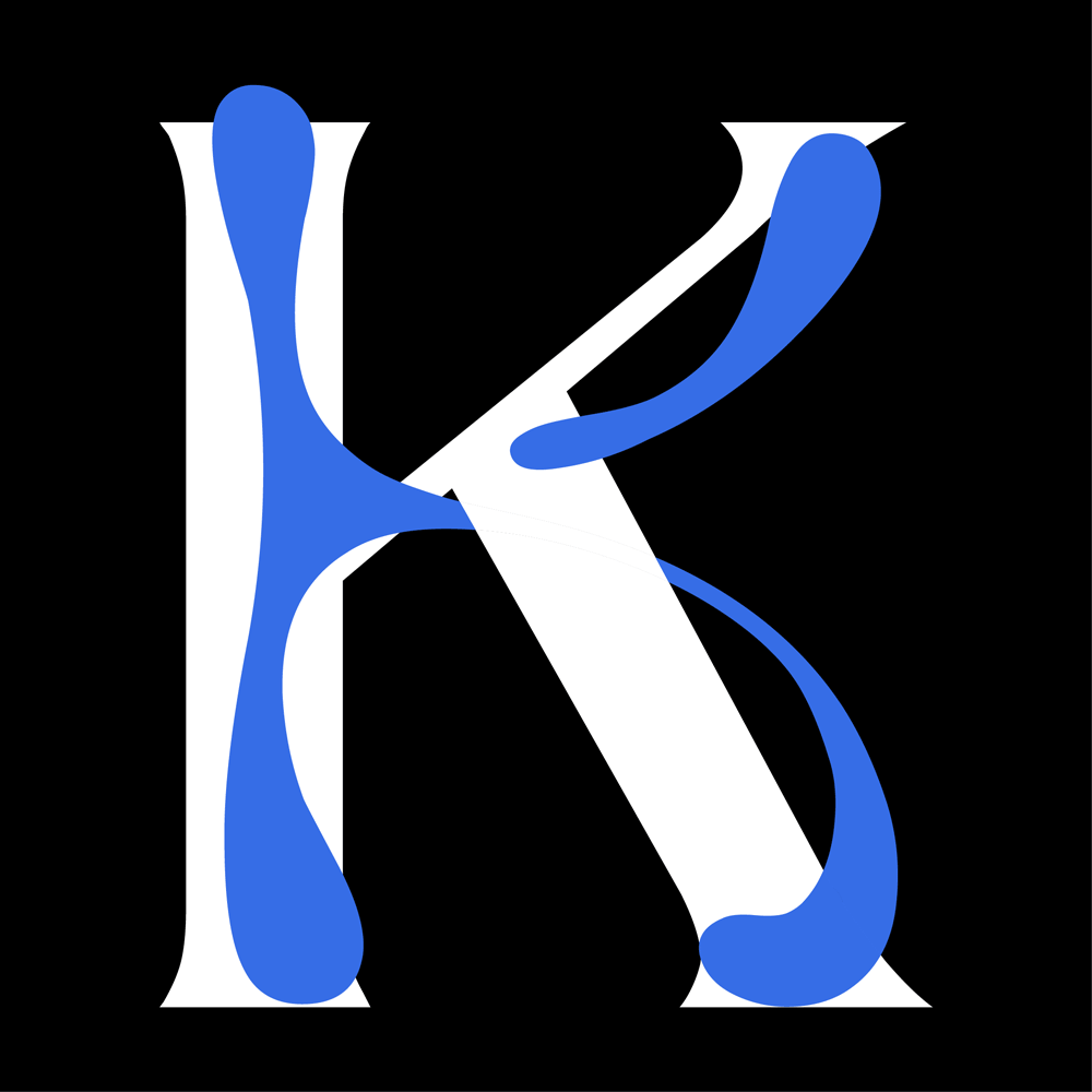
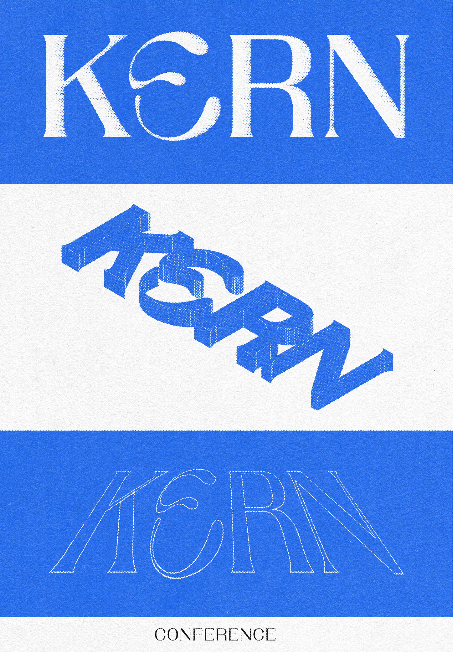
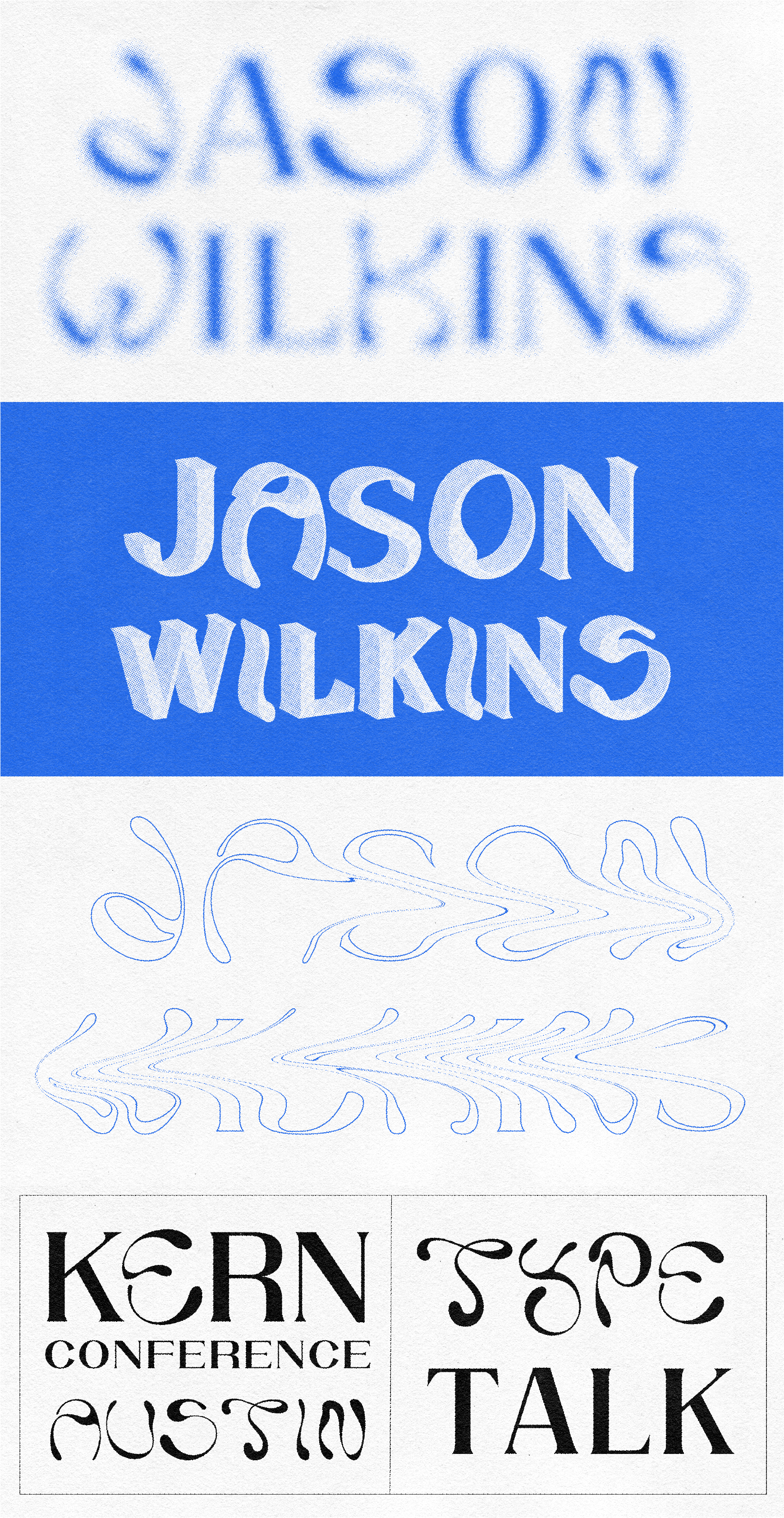
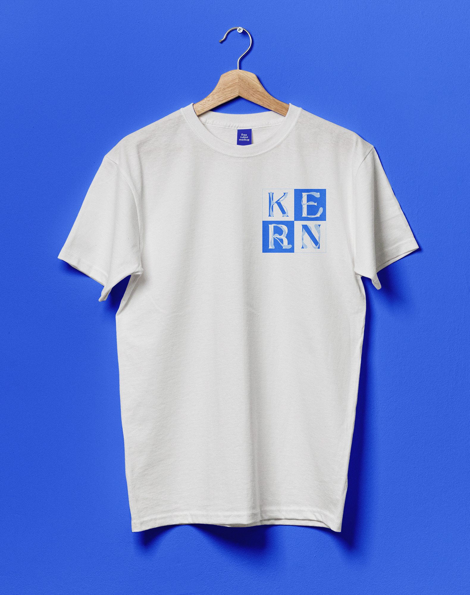
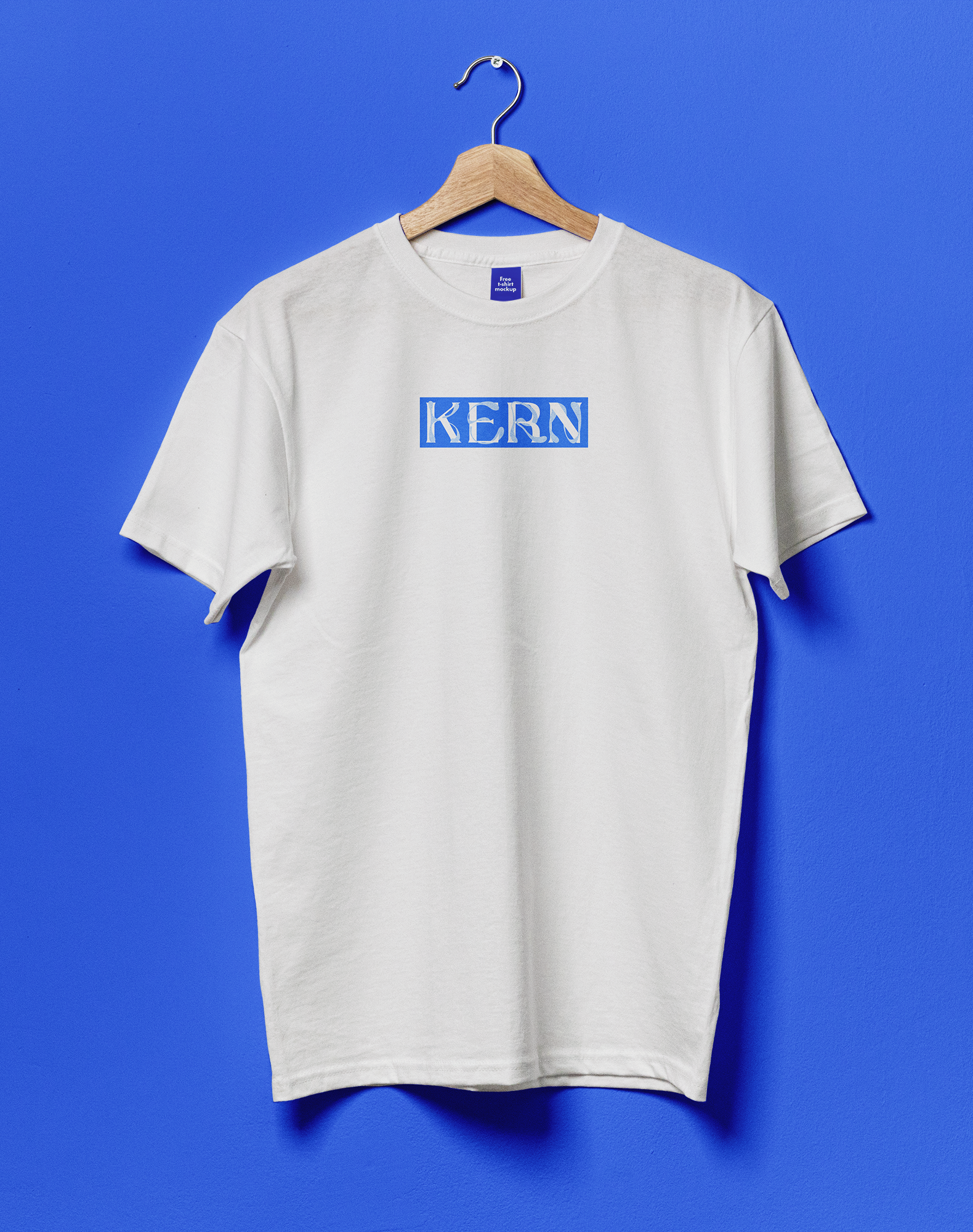
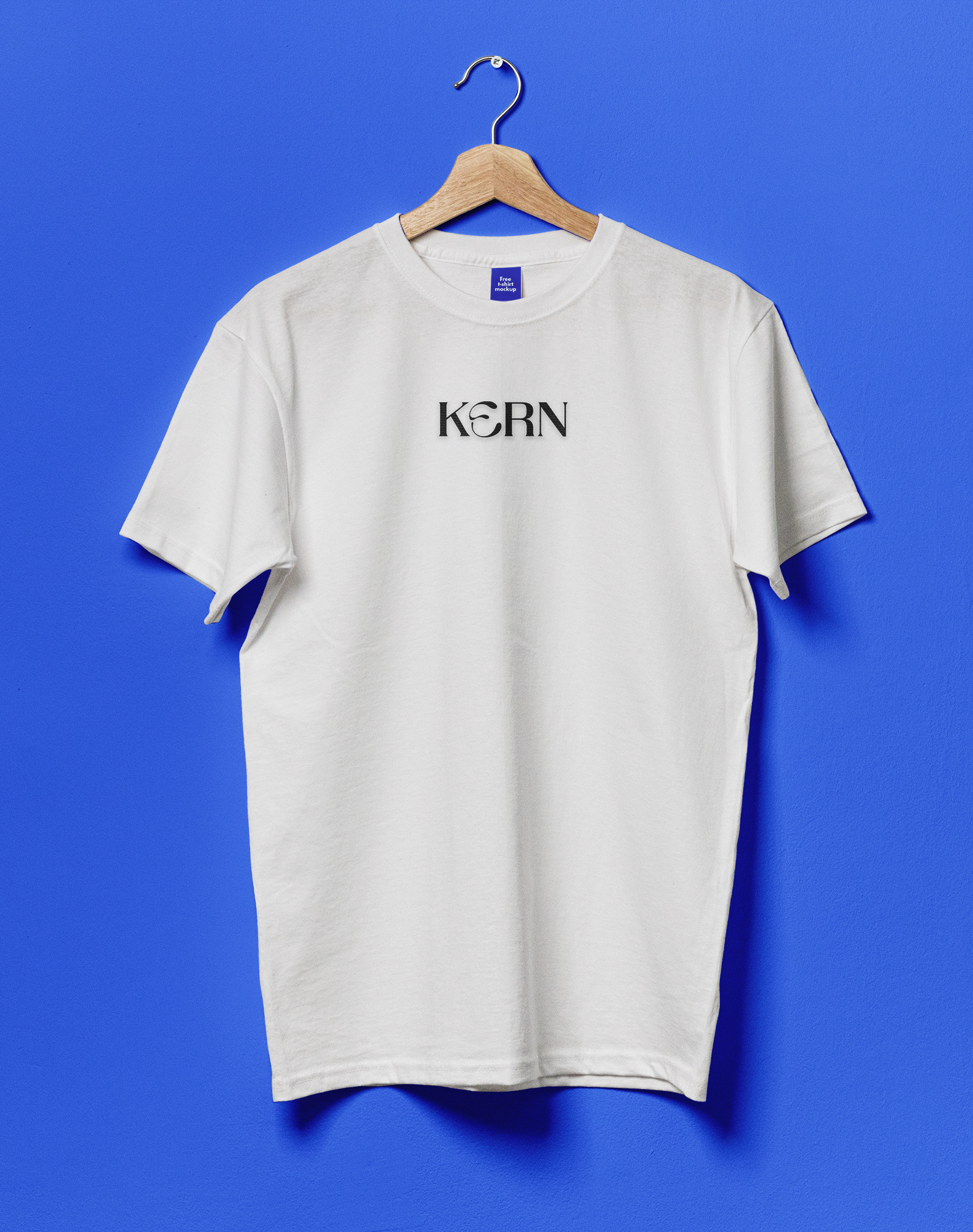
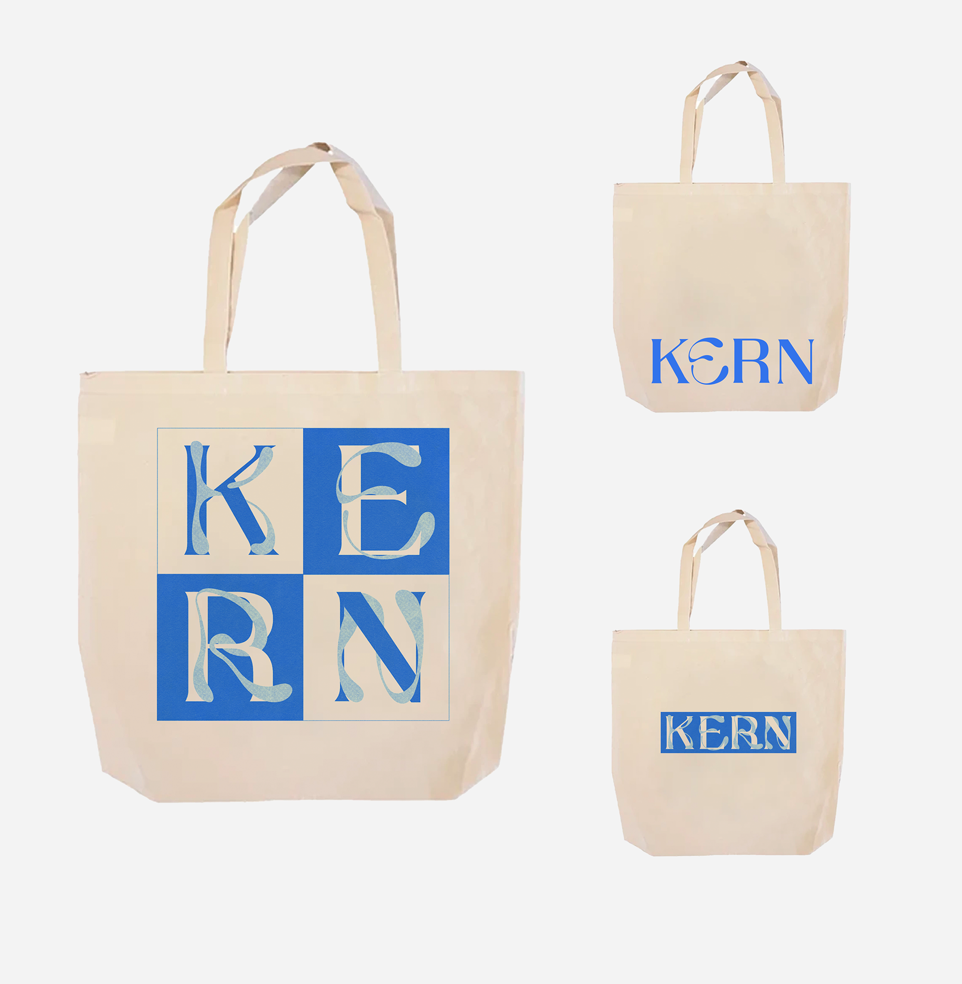
MAIN LOGO

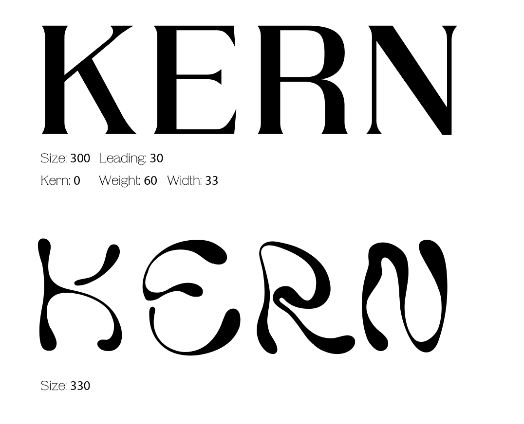
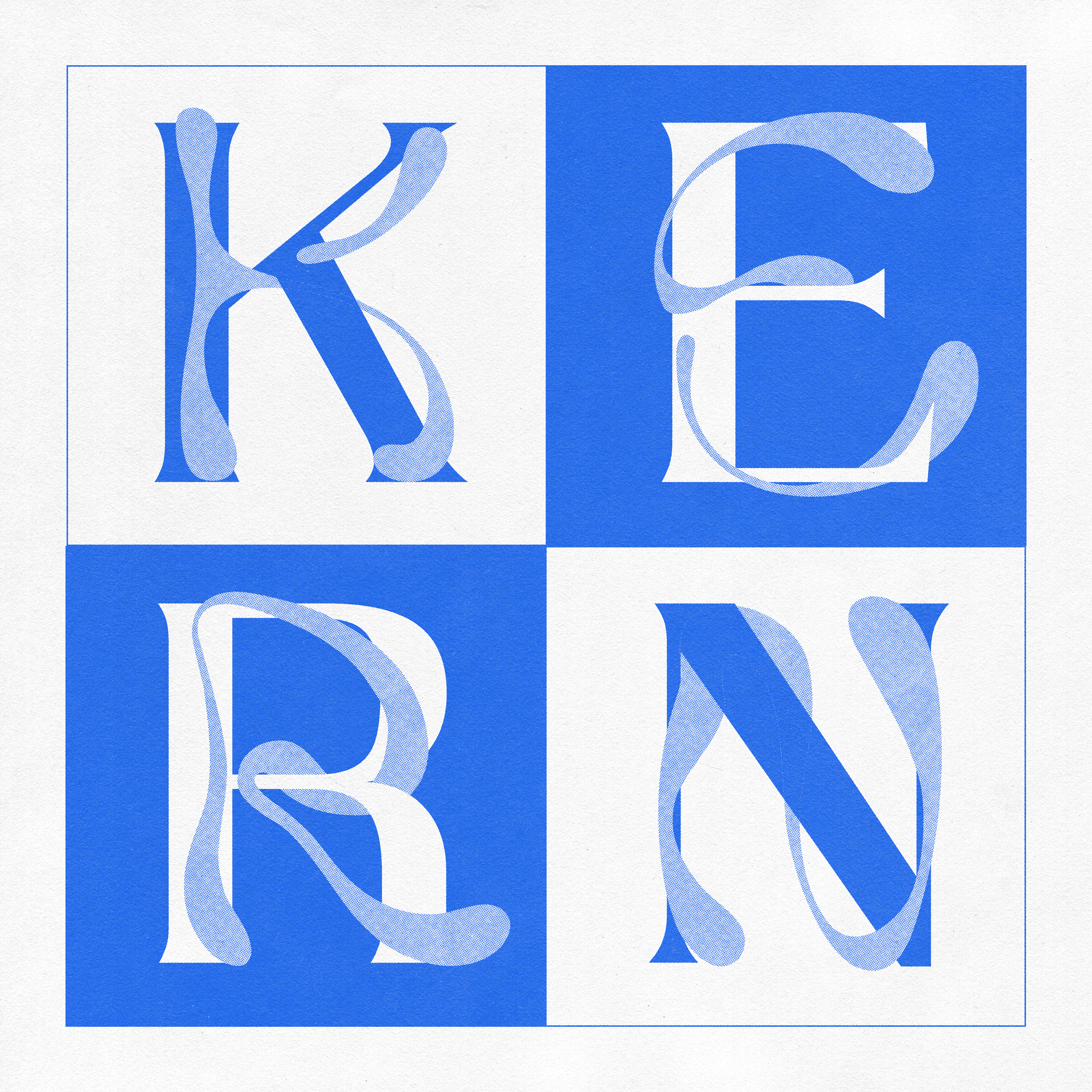
Layered Type
This Identity system was built using two different typefaces.
Octane: A Variable Serif Type Face
Ladi: A Fluid San Serif Display Type
When combined, both fonts work together to create an elegant image that celebrates the letterforms of the typefaces.

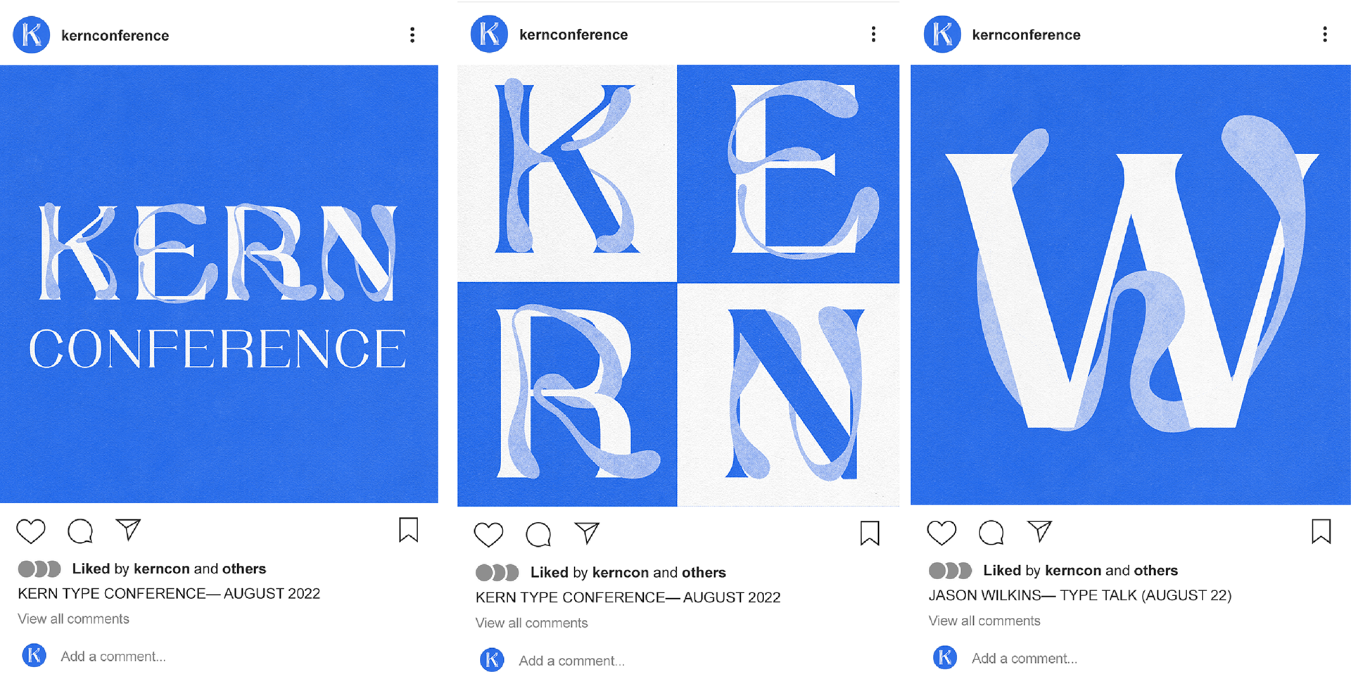
INSTAGRAM FEED
MERCHANDISE
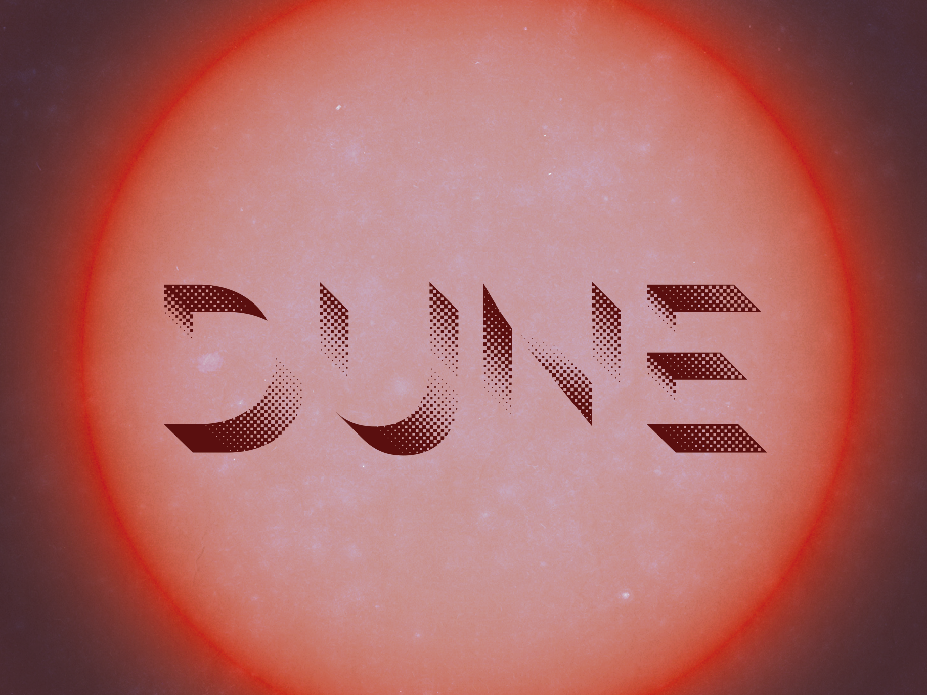
POSTERS AND ADVERTISEMENTS